 |
| Film Noir Mood Board |
One idea was to look at the Literature themes, here we thought about perhaps detective novels and using the descriptions from a book and translating them into an image. Straight away from thinking this we thought Film Noir. However even though the final image might have been good aesthetically we thought it might not push us to our fullest potential and thought it was something we could perhaps do in out time to play with this kind of lighting and effects for an image.
 |
| Protest Mood Board |
 |
| Warhol Mood Board |
 |
| Marilyn Monroe, Andy Warhol |
 |
| Soup, Andy Warhol |
Our concept radically changed from our initial one as we spoke with the tutors. They developed our thoughts and inspirations and helped us to our concept. We decided that instead of making an andy warhol set and trying to give an underline of anti consumerism that we should make a set of anti consumerism with Andy Warhol being the undertone.
We wanted to show through our set how, as a person, everyone is surrounded and engulfed by different products and brands. In this capitalist world we live in it is impossible to escape brands. They dominate our lives, most of the brand we use are owned by the same major corporations. There are even cases where one corporation will create another popular product similar to another of theirs to control that particular market.

We decided to use three walls, each with a different color, as a way to show that consumerism isn't easy to escape. When you think that you have found a way out it just ends up being different products or brands. We used 3 colours: red, blue and yellow. We did this as nod towards Andy Warhol and his "Soup" series. We shot various different products in a studio environment and then photoshopped them together to make the wallpaper.

__________________________________________________________________________________
Roles in the group
- Kym Mumford: Build Lead http://kmumford.blogspot.com/
- Harry Scott: Props, Camera Master http://hscottphotography.blogspot.com/
- Chris Turner: Shoot Co-ordinator, Health and safety
- Josh Jordan: Casting, Post Production http://jljordan.blogspot.com/
- Aaron Price: Lighting http://aaronpriceuca.blogspot.com/
To start with we looked for visual references and styles to inspire our work. We looked at the work of Chris Jordan and his series "Running the Numbers". A series where he shot products in different ways and then put them together digitally to create a huge print that from a distance resembled somewhat artistic but if looked closer astonished and impacted the viewer. He then highlights the image with a fact about waste, pollution and other matters to impact the viewer in to thinking about the way they treat waste.
 |
| Depicts 400,000 plastic bottle caps, equal to the average number of plastic bottles consumed in the United States every minute. |
 |
| Depicts two million plastic beverage bottles, the number used in the US every five minutes. |

We then looked towards film for inspiration and found to films that helped us settle on an idea and a set: "Men in Black II" & "Hurt Locker". "Hurt Locker" is a film about a bomb disposal expert, when he comes back from war he is given a simple task by his wife to pick up some cereal but is confronted by walls of cereal. It doesnt seem real in comparison between his work, life threatening war zone and back to 'life' where its literaly just consumerism and wants, shown by these walls upon walls of produce. From here we took inspiration for walls of produce and then used our initial Andy Warhol and transformed it.


The scenes we took inspiration from in "Men in Black II"are the ones where a different world is hidden in a locker and right at then end that shows the human world being nothing more than the same in an alien race's locker. From here we took the inspiration of a door leading to a different world in the middle of a wall.

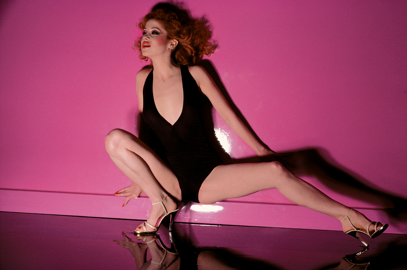
As an initial lighting reference we looked towards Guy Bourdin. Below is photo for the Vogue Paris 1977 what interested us in this image was the shine on the back wall paint. It's this shine that might be very useful for our set as it sparks off visual connotations of plastic, which then gives the idea to the viewer of everything in the set showing falseness.

For the character we were looking for a young 9 to 5 worker who still had an eye on fashion. A person that works for these big corporations without knowing all the bad things they do, a person who is in the consumerism cycle of working in a corporation to earn enough money to but products from that and other companies. Knowing this we looked for models with a strong face and looks that would look good in a suit. We did a quick casting around university and also looked outside of the university and then choosing a select few of these looked at them in a suit to choose our final model, Tom.


From here we chose Tom and Brendan to see how they looked in suits.


We decided on Tom as we thought that the look he gave the camera would be more interesting but kept Brendan as second choice. We went with Tom to Bluewater to find a suit that fit. At the last moment Tom had to back out for work reasons, luckily the suit we had bought still fit Brendan.
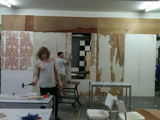
SET BUILD WEEK:


No comments:
Post a Comment