Sunday 25 March 2012

Commission


The Commission project consists of a theme commissioned by our tutors from which we have to think of a concept, research artists and facts about it and then make a series of at least 3 images. The theme given to us is waste, it can relate to any sort of waste, human, animal, toxic, rubbish, etc. The only rules we have to follow are that it has to be related to the theme, shot with either a medium format or a large format analogue camera and it has to be taken either in the studios in campus or on location around the Medway area.

After the first lecture I went for a walk along the Medway river towards M2 bridge with my 35mm camera and took a few shots. In this walk I noticed the random litter around the river, what could be called fly tipping or illegal dumping. I think the randomness and the spontaneous of the rubbish found to be interesting, the idea that people can just throw stuff away in the river and fields is something worth investigating into the background, the laws and the so called “benefit” that people get from it.
I want to highlight the diversity of the objects found around the Medway area through an object shoot in the style of Keith Arnatt's series "Pictures from a Rubbish Tip", Irving Penn's "Cigarette" series and David Maisel's series "Library of Dust". Taking items away from the street and shooting them in the studio environment, this way highlighting the objects, and in this case the variety and randomness of the objects that can be found in 100 meters of river bank in the Medway Area.


Keith Arnatt's series i
s a body of work devoted to images of decomposing food, some in their plastic wrappers, some naked; all of which have a delicate, almost transcendental, beauty. is more artistic, looks for a more aesthetic view towards litter picked up in dustbins. It has a romance to aesthetic, making the viewer want to look at it, but once you take a proper look at the image, focusing on the object, you can see the grime and dirtiness that represents rubbish. Arnatt uses the medium of photography with the sensibility of a painter. Colour is important to him, and this comes out in one image depicting a strip of bacon and a piece of eggshell against a backdrop of plastic partially obscuring a pink floral pattern behind. Arnatt has transformed the unwanted into something, at least pictorially, highly desirable.


Penn's work depicts his interest and fascination in photographys ability to make the mundane interesting. He made a series of cigarette photographs in the 1970s in which he recorded the cigarette butts he found. The cigarette series show photographys ability to objectively record and to make fascinating at the same time. Penns imagery elevates this ordinary piece of detritus to sculptural form. He shows photographys ability to take an object, shape or form out of context and produce an artistic form from it. 


Library of Dust is a haunting series of images by David Maisel, who photographed a collection of corroding copper canisters containing the cremated remains of patients at the Oregon State Insane Asylum from 1883 to 1971. The canisters are beautiful. The abandoned remains have reacted with the copper to create colourful deformations on the canisters that often appear to be bubbling over. The visual poetry is beautiful, bewildering and bewitching. 


With Christy's help I found a photographer by the name of Andy Hughes. His pieces of rubbish on the beach have a sculptural quality, highlighted through the choice of high saturation, texture and colour. He looks at beach litter not as something that spoils the landscape but its beauty. His work titled 'Dominant Wave Theory'was exhibited at the Mariners Museum in Virginia, USA (30th May-3rd Jan 2010). This work took 10 years to complete and was part of 'Surfers against sewage' which were part of Cornwall's clean up of their beaches. 


His photographs highlight the disposable lifestyle of humans and the cost on the environment. I guess then his work was inpsired by the work of the New Topographics; whose ideas explored the increasing imprint of man on the landscape. His objects create aesthetic forms, isolated in the surroundings of the lonely beaches and by tthe tight cropping of the frame. The audiences attention is drawn to the large scale composition and the saturated colours highlighting the beauty in the rubbish forms.

Tuesday 6 March 2012

Referral: Critical Reviews

Object:  I have always been close to nature. As I have been surrounded by it most of my life. This summer deforestation caused by forest fires, affected my surroundings last summer. This is my inspiration for my referral. Plants and trees are universal symbols found in every spiritual tradition, symbolising wisdom, protection, beauty, redemption, etc. I researched factual details about deforestation, mostly in the Amazon as well as photographers.
My biggest inspiration is Daniel Beltrà a spanish conservation photographer, but also researched Edgar Martins, Robert Adams and Nick Moir.
This project has developed my sense of research, and the value of it whilst also highlighting the massive deforestation problems in the world. I believe I could have done better with a wider time-frame with this idea but that also is a learning process for me, factoring in everything else and making myself a schedule.


Cityscape: To start with, in the referral for this project I had an idea of shooting a journey from Kings Cross to Camden Lock, and idea I had to change once I saw it was hard to achieve in the time frame I had. My concept then moved onto the consumerism and capitalism governing modern arquitecture. The plasticity and fakeness of the new buildings. 
For this project I took inspiration and researched Olivo Barbieri, Thomas Struth and Gabrielle Basilico. My biggest inspiration out of the three was Gabrielle Basilico, as his style suited my project and the way he takes mundane buildings and shoots them in a manner that makes them seem important and of a cultural or historical value. 
I believe this project could have gone better as it was setback by camera problems, such as the Bronica I took out popping open in the bag without my knowing or being kicked out from one of my initial places I wanted to shoot as it was "private property". Even then I am satisfied with the images that have come out in the end.

Thursday 1 March 2012

Referral: Cityscape

For my cityscape referral I had the initial idea of shooting a journey between King's Cross and Camden Town through the canals at night, a journey I had previously made with two of my friends. I found the canal very interesting, especially the underside of the bridges we pasted, every single one is different. They each have a different feeling to them, some feel darker than others, some had murals, some had graffiti, some had collages, some had a blue neon light, etc.


 I took this idea along to my tutorial, along with several artists I wanted to research for this idea, as I hadn't had a chance to do it properly. These included: Brassai's series "Paris After Dark"; Dan Holdsworth for his images involving night photography and different ways of using artificial light, Alan Delaney's series "London After Dark" as the place I wanted to shoot was London at night and finally Naoya Hatakeyama and his series "Underground/River" really had me intrigued. Steffi, at my tutorial then told several artists I could look at to help me with this idea. In specific she told me to have a look Francis Alÿs, Hamish Fulton and Richard Long to really think of the idea of a journey. She told me that just shooting the underside of the bridges would not reflect the idea I wanted to transmit and that I should think of something else.


I researched these photographer as well as David Hockney. I came to the conclusion that in the time I had to go to London and explore, then go back and shoot I did not think I would be able to transmit the idea of a journey and instead would look like random shots. I then decided to look at the idea of mass consumerism that cities have taken, where everything is mass produced. I find it hard to find a shop that is not a franchise, or a shop the just sells branded products. Everybody looks for the cheaper products to live their life, this in turn makes products look worse by even making the wrapping cheaper making the over all product look like plastic. This has also started to transmit into arquitecture, new hotels and buildings don't use materials such as brick anymore they use a metal that looks like plastic. The sun reflects weirdly off it and paint makes it worse.


For this project I researched three artists: Olivo Barbieri, Thomas Struth and Gabrielle Basilico. I was inspired by the work of Olivo Barbieri, especially by his capability to transform the city and the perception we have for it. Gabriele Basilico and his great ability to let the building speaking about a deep human condition, without the presence of any human figure in his images.


Gabriele Basilico is an arquitectual photographer. He is among the leading international photographers, after studying architecture profession as a photographer began devoting himself to landscape photography, and more particularly to architectural photography.
He works mostly with view camera and black and white film. His work in Beirutphotographed after the war, is especially celebrated. This quote, translated from italian, speaks about his work: 
"With his imagesthe controlled, conscious metaphysical tensionhe has effectively worked for in recent years, the post modern tastevisually noting someforgotten industrial architecture and suburbanrevalued as archaeological and fastened with a heavy chiaroscuro and a perspective, and fleeting gated,sophisticated style in the '30s ". I particularly looked at his cityscapes, were he focuses on mundane buildings, places that can be found anywhere and don't have any significant fame or history, and shoots them in a way that highlights them and makes them look like a great and important arquitectonic pieces of the century. The style of taking the photograph from below, in my images, came mainly from Basilico. 


I also used Thomas Struth as an influence because of his work ,Struth states that he seeks to record the face of urban space, seeing the architectural environment as a site where a community expresses it history and identity which was something that I was also keen to express in my work. This relates to my idea that nowadays people want to spend less, making everything look cheap.


I traveled to London to find some of these buildings and found them straight away, even before I stepped off the train, as to go to Victoria you go straight past a selection of new buildings in Chelsea that had differente designs. When I got off the train I turned back on myself and walked towards the direction of the buildings. On the way I made another discovery, Victoria's Bus Station is a building exterior is made out of metal girders and glass windows, giving it a very industrial look, a basis of consumerism. I then continued to the buildings I had seen on the train and took a few photos on my digital camera as test shots to see how they would look.
I then went back on Wednesday 29th of February with a Bronica SQ-B. I went back to places I had been before but got kicked out from one place by a security guard, saying I could not take pictures. The day was overcast that made the light quite neutral helping me show the plasticity of the buildings.


Friday 24 February 2012

Referral: Object & Body

For my referral of the Object Brief I have looked into environmental issues of all sorts but specifically deforestation and forest fires, two similar but also different issues. I chose these because last summer there were forest fires very close to my house in Mallorca, thought to be caused by the intense heat, that burnt hundreds of square meters worth of forest and also came very close to my home.
Forest Fire in Costa d'en Blanes


I have researched into the causes of deforestation, forest fires being just one of them, including human expansion of suburban cities, logging, population growth and commercial agriculture. I have also researched the deforestation occurring in the Amazon Rainforest. I found out that the Earth has lost from 415,000 to 587,000 square kilometers worth of trees since 2006, most of it from the Amazon. Then I researched all of the effects, local and global, that this deforestation caused, such as worsening of atmospheric conditions, the soil, biodiversity and the economic impact.


I then moved on to photographers and artists that did work related to deforestation. I found a spanish photographer by the name Daniel Beltrà who calls himself a conservation photographer. He has three projects: "Rainforest" dealing with the deforestation in the Amazon and various other countries; "Oil" dealing with the oil spill in the Mexican Gulf; and "Water" visualising the melting of the icecaps and the separation of the poles. Out all of these the one I focused most on was "Rainforest". It crosses several styles (landscapes, portraits and still life). He normally travels on a helicopter to take landscapes of the devastation of the natural landscape. His work is a way for him to criticise the human effect on nature and to shock people into action to change and stop this. His use of dramatic scenery is a clear reference to this and also a way of trying to change people's mind towards the way they treat nature, to sensitise them and also to make them think.


Another photographer I have looked at is Edgar Martins in particular his series "The Rehearsal of Space". A series depicting the aftermath of the immense forest fires that occurred in Portugal in 2005 & 2006.
I think John Beardsley explained Edgar Martin's work best in is book " Topologies of Place":


"It is hard to believe that representation of ruin could be so seductive- this is especially true of those photographs shot along the creek, where the vivid greens of vegetation are just being invaded by flame, which drips off the riverbank and is reflected in the water. In those photographs where the fire is more advanced, Martins achieves rich atmospheric effects. Thick haze focuses our attention on the foreground, as in the shot of a pair of pine trunks rising out of the ferns and set against scrim of smoke. As in the more monochromatic Iceland pictures, atmospheric conditions have a pronounced effect on pictorial space. Only a couple of images have any suggestion of spatial depth- in one, we are looking up a blackened valley; in another, a road disappears into the smoke. The rest are foreshortened, focusing our attention on the qualities of line, the tonalities of smoke, the colors of flame. Martins’ intentions in these images were not only pictorial, of course; there is a contemporary anxiety to them as well. Portugal’s 2005/2006 fires were the result of extended drought and extreme; many believed them to be an expression of global climate change. Moreover, they could be seen as evidence of environmental mismanagement: much of the forest was eucalyptus, a fast-growing but extremely flammable tree that is frequently planted in reforestation projects. Martins was in search of the story as much as pictorial effects in these images of fire. There is tantalizing convergence of subject and medium in these smoky photographs. They both portray and are made possible by one material suspended in another: their subject is suspended in carbon; their medium photographic emulsion. Martins went to considerable effort to capture these images: he completed a residency and training with fire fighters in Portalegre before being allowed to work in the field with them, and he coordinated his work with the National Fire Protection Unit. This effort, he recounts, was expressive of commitment he generally makes to the “sites, places and people” he photographs. In the case of the Portugal Fires, it enabled him to work close-up to the flames, using a still wider-angled lens than he typically uses. Proximity to fire resulted in a technical accident that accounts in part for the quality of the images: in extreme close-ups of the flames, the film was fogged by exposure to intense heat, which reinforces the atmospheric quality of the smoke. In a sense, the subject became the medium here— the heat is presented as much as re-presented; it enacted a technical transformation that was encoded in the film itself."


Next I researched Robert Adams "Turning Back" series. A series about the deforestation occurring in the North-West of the United States of America. He considers it a grim journey starting on the eastern coast and traveling through and industrial forest and ends in a small town in the deserts of Oregon. He depicts it as a way of him saying "It's not over". He is a huge defender of trees and natural environments, seen here in the following quote extracted from an Interview he did:
"So, if you haven’t loved a tree enough (if not to hug it, at least to want to walk up to it and touch it as if you’re touching a profound mystery)—if that experience has eluded you—I feel bad for you because you’re not going to live a happy life."


Finally I looked at Nick Moir, an experienced Fire Photographer who shot the record-breaking bush fires in Australia in 2009. After Australia's most prolonged drought on record, its bushland was at heightened risk of burning during the fire season. A combination of high temperatures and strong winds in the October to December summer months resulted in intense, fast-moving conflagrations. Some were started by arsonists. Huge fires on the land surrounding outer suburbs of Sydney, and later also the capital Canberra, destroyed property and homes. Rough terrain, thick bushland and eucalyptus forests often hampered fire-fighting operations. The fires destroyed everything it touched: woodland, houses, animals, even humans perished cause of the fires. Nick said that even that he has seen many fires, the scale of these and the scale of destruction was hard to comprehend. All of this is reflected in his work. The sense of destruction is clearly evident in his work.


Saturday 18 February 2012

Fashion: Constructed Image

In our group we came up with three ideas, we couldn't decide on one right away so started to research all three then will choose one when it come apparent which is the strongest.
Film Noir Mood Board
One idea was to look at the Literature themes, here we thought about perhaps detective novels and using the descriptions from a book and translating them into an image. Straight away from thinking this we thought Film Noir. However even though the final image might have been good aesthetically we thought it might not push us to our fullest potential and thought it was something we could perhaps do in out time to play with this kind of lighting and effects for an image. 
Protest Mood Board
Another idea was to follow the News and Current Affairs theme, looking at the protests something we all as a group was interested in and some of us had been to. This idea appealed to us much more than the Film Noir idea as it was something that could push us as a group and as a concept. Its still something we might be looking at as it could be a very strong image and have some structure behind it. One doubt was how to represnt the street protests in a studio, it might loose its feel or meaning by trying to recreate the protest in a studio, might almost become far to 'fake' and maybe mock. However this is strong idea which hasnt been completely struck off like the Film Noir idea.
Warhol Mood Board
The idea we decided to carry on with was one which followed the Art and Artist theme, decided to look into the world of Pop Art and mainly focusing on Warhol. As a group we felt this might be a bit of fun to do and definitely push us to create something worth while. We thought this could be executed to a high level in a studio as our initial plan is to break the studio into three sets then have three models, one in each room. Playing on the repetition of Warhols work have everything about the room identical to each other, same props etc but in different colour. Running with the Art and Artist idea: Andy Warhol Key Points to idea: Set to be in three Each room in its own colour same props in same position as each other in the rooms Each model to look same Must be an anti-consumerist under tone We decided to play off the repetition of Andy Warhols work as it was in a way his way of protesting against the pop culture and how celebrities and people of stature can be in a way churned out like as if in a factory. Also to enforce this the type of print was even able to be done in a large scale, mass produced way. The screen printing process cuts out the individuality of the celebrity.
Marilyn Monroe, Andy Warhol
Soup, Andy Warhol

Our concept radically changed from our initial one as we spoke with the tutors. They developed our thoughts and inspirations and helped us to our concept. We decided that instead of making an andy warhol set and trying to give an underline of anti consumerism that we should make a set of anti consumerism with Andy Warhol being the undertone.

We wanted to show through our set how, as a person, everyone is surrounded and engulfed by different products and brands. In this capitalist world we live in it is impossible to escape brands. They dominate our lives, most of the brand we use are owned by the same major corporations. There are even cases where one corporation will create another popular product similar to another of theirs to control that particular market.

We decided to use three walls, each with a different color, as a way to show that consumerism isn't easy to escape. When you think that you have found a way out it just ends up being different products or brands. We used 3 colours: red, blue and yellow. We did this as nod towards Andy Warhol and his "Soup" series. We shot various different products in a studio environment and then photoshopped them together to make the wallpaper.


__________________________________________________________________________________

Roles in the group

- Kym Mumford: Build Lead http://kmumford.blogspot.com/

- Harry Scott: Props, Camera Master http://hscottphotography.blogspot.com/

- Chris Turner: Shoot Co-ordinator, Health and safety

- Josh Jordan: Casting, Post Production http://jljordan.blogspot.com/

- Aaron Price: Lighting http://aaronpriceuca.blogspot.com/


To start with we looked for visual references and styles to inspire our work. We looked at the work of Chris Jordan and his series "Running the Numbers". A series where he shot products in different ways and then put them together digitally to create a huge print that from a distance resembled somewhat artistic but if looked closer astonished and impacted the viewer. He then highlights the image with a fact about waste, pollution and other matters to impact the viewer in to thinking about the way they treat waste.
Depicts 400,000 plastic bottle caps, equal to the average number of
plastic bottles consumed in the United States every minute.

Depicts two million plastic beverage bottles,
the number used in the US every five minutes.
 We also looked at Andreas Gursky's image "99 cents". It became famous for becoming the most expensive image ever when it was sold for the first time in 2007. It depicts an overhead view of a 99 cent store with numerous brands and products.


We then looked towards film for inspiration and found to films that helped us settle on an idea and a set: "Men in Black II" & "Hurt Locker". "Hurt Locker" is a film about a bomb disposal expert, when he comes back from war he is given a simple task by his wife to pick up some cereal but is confronted by walls of cereal. It doesnt seem real in comparison between his work, life threatening war zone and back to 'life' where its literaly just consumerism and wants, shown by these walls upon walls of produce. From here we took inspiration for walls of produce and then used our initial Andy Warhol and transformed it.


The scenes we took inspiration from in "Men in Black II"are the ones where a different world is hidden in a locker and right at then end that shows the human world being nothing more than the same in an alien race's locker. From here we took the inspiration of a door leading to a different world in the middle of a wall.

As an initial lighting reference we looked towards Guy Bourdin. Below is photo for the Vogue Paris 1977 what interested us in this image was the shine on the back wall paint. It's this shine that might be very useful for our set as it sparks off visual connotations of plastic, which then gives the idea to the viewer of everything in the set showing falseness.


Bourdin's 1985 photo for Vogue Paris has certainly sparked off many ideas. The fact the mannequins are naked reaching out beyond the shop front glass to the models dressed in the clothes gave us many ideas.


For the character we were looking for a young 9 to 5 worker who still had an eye on fashion. A person that works for these big corporations without knowing all the bad things they do, a person who is in the consumerism cycle of working in a corporation to earn enough money to but products from that and other companies. Knowing this we looked for models with a strong face and looks that would look good in a suit. We did a quick casting around university and also looked outside of the university and then choosing a select few of these looked at them in a suit to choose our final model, Tom.


From here we chose Tom and Brendan to see how they looked in suits.


We decided on Tom as we thought that the look he gave the camera would be more interesting but kept Brendan as second choice. We went with Tom to Bluewater to find a suit that fit. At the last moment Tom had to back out for work reasons, luckily the suit we had bought still fit Brendan.

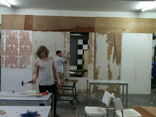
SET BUILD WEEK: